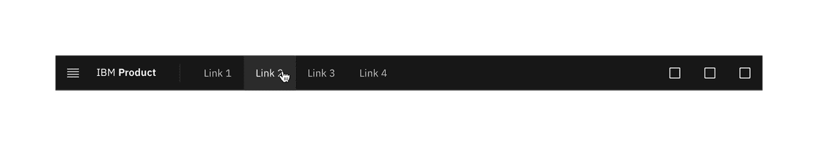
UI shell header
Color
The UI Shell can be customized to use any of the four IBM themes by applying an inline theme to the shell zone.
| Element | Property | Color token |
|---|---|---|
| Header | background color |
|
| border-bottom |
| |
| Product name | text color |
|
Menu
| State | Property | Color token |
|---|---|---|
| Enabled | svg |
|
| Hover | background color |
|
| svg |
| |
| Focus | border |
|
| Active | background color |
|
| svg |
|
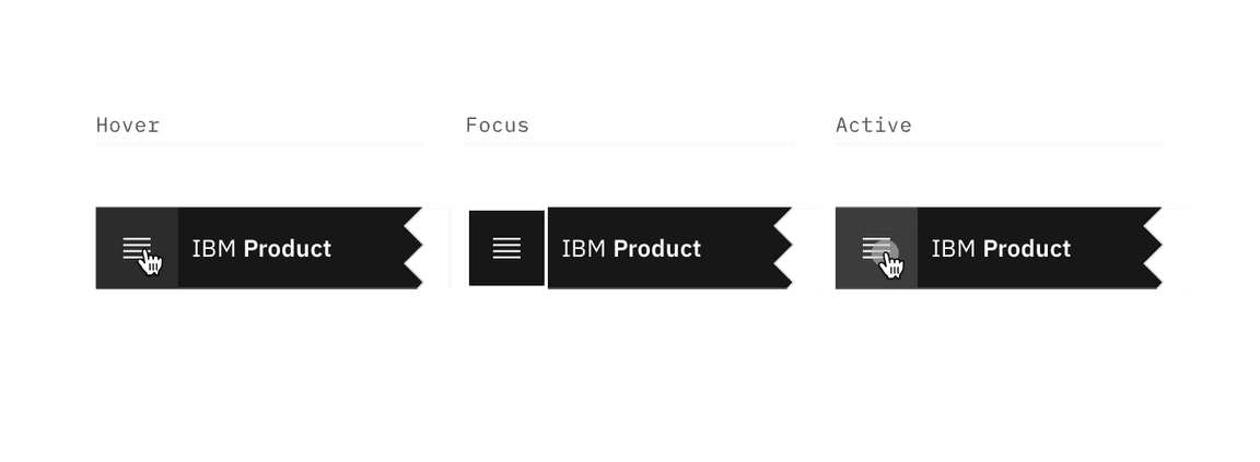
Menu-trigger interactive states
Header link
| State | Property | Color token |
|---|---|---|
| Enabled | text color |
|
| Hover | background color |
|
| text color |
| |
| Focus | border |
|
| Active | background color |
|
| text color |
| |
| Selected | background color |
|
| text color |
| |
| border-bottom |
|
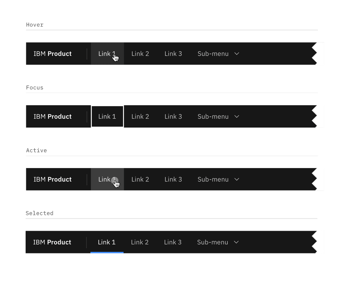
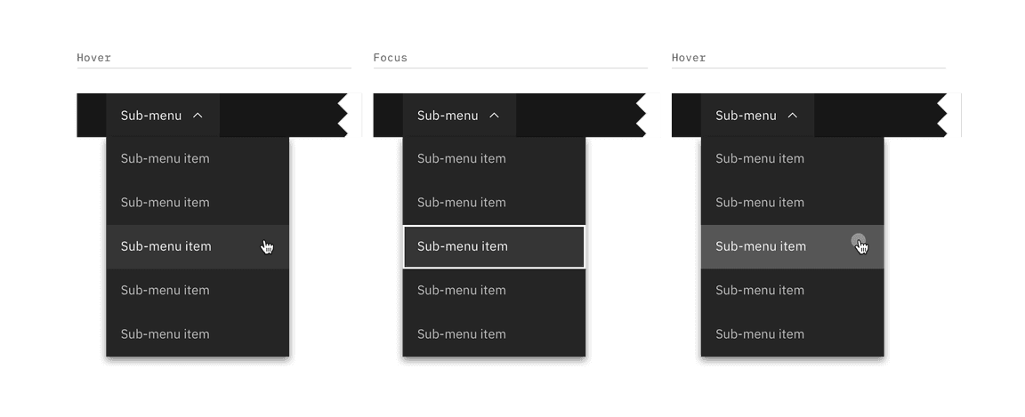
Sub-menu interactive states
Sub-menu
| Element | State | Property | Color token |
|---|---|---|---|
| Sub-menu | Enabled | background color |
|
| text color |
| ||
| svg |
| ||
| Hover | background color |
| |
| text color |
| ||
| svg |
| ||
| Focus | border |
| |
| Active | background color |
| |
| text color |
| ||
| svg |
| ||
| Selected | background color |
| |
| text color |
| ||
| svg |
| ||
| Item | Enabled | background color |
|
| text color |
| ||
| svg |
| ||
| Hover | background color |
| |
| text color |
| ||
| svg |
| ||
| Focus | border |
| |
| Active | background color |
| |
| text color |
| ||
| svg |
| ||
| Selected | background color |
| |
| text color |
| ||
| svg |
| ||
| border-left |
|
Header actions
| State | Property | Color token |
|---|---|---|
| Enabled | svg |
|
| Hover | background color |
|
| svg |
| |
| Focus | border |
|
| Active | background color |
|
| svg |
| |
| Selected | background color |
|
| border |
| |
| svg |
|
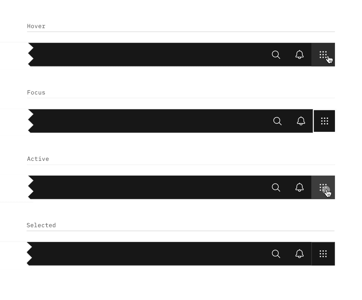
Header action interactive states
Typography
Menu labels and text should be set in sentence case.
| Element | Font-size (px/rem) | Font-weight | Type token |
|---|---|---|---|
| Product name | 14 / 0.875 | SemiBold / 600 |
|
| Company prefix | 14 / 0.875 | Regular / 400 |
|
| Header link | 14 / 0.875 | Regular / 400 |
|
| Sub-menu | 14 / 0.875 | Regular / 400 |
|
Structure
The header should span the full width of the browser window. The header can either stay sticky to the top of the browser or scroll away.
| Element | Property | px/rem | Spacing token |
|---|---|---|---|
| Header | height | 48 / 3 | – |
| Menu | height, width | 48 / 3 | – |
| Product name | padding-left | 16 / 1 |
|
| padding-right | 32 / 2 |
| |
| Link | padding-left, padding right | 16 / 1 |
|
| Sub-menu | padding-left, padding right | 16 / 1 |
|
| Chevron | padding-left | 8 / 0.5 |
|
| Sub-menu item | padding-left, padding right | 16 / 1 |
|
| Header action | height, width | 48 / 3 | – |
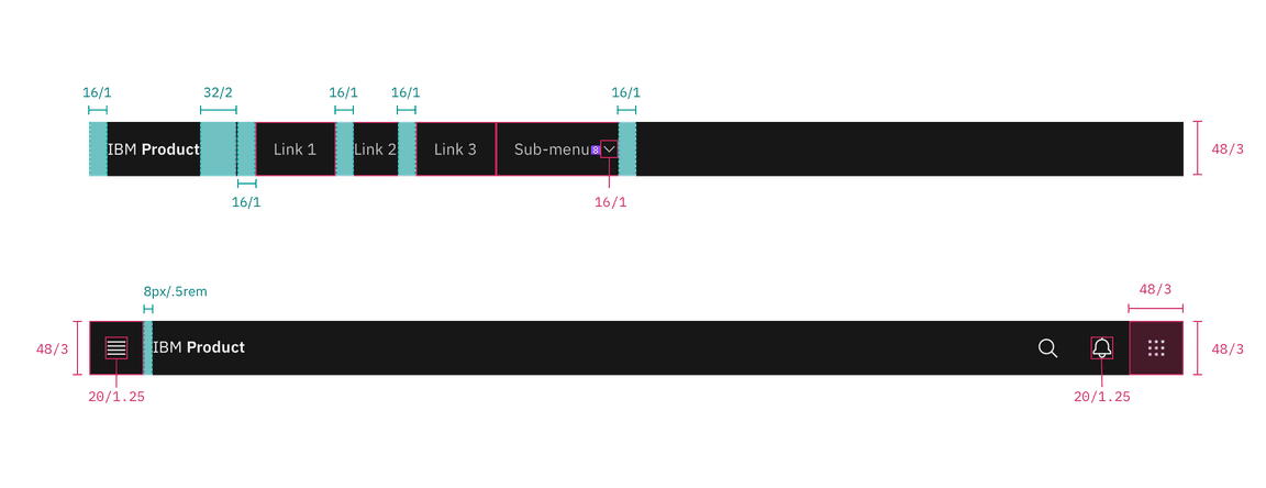
Structure and spacing measurements for UI shell header | px | rem
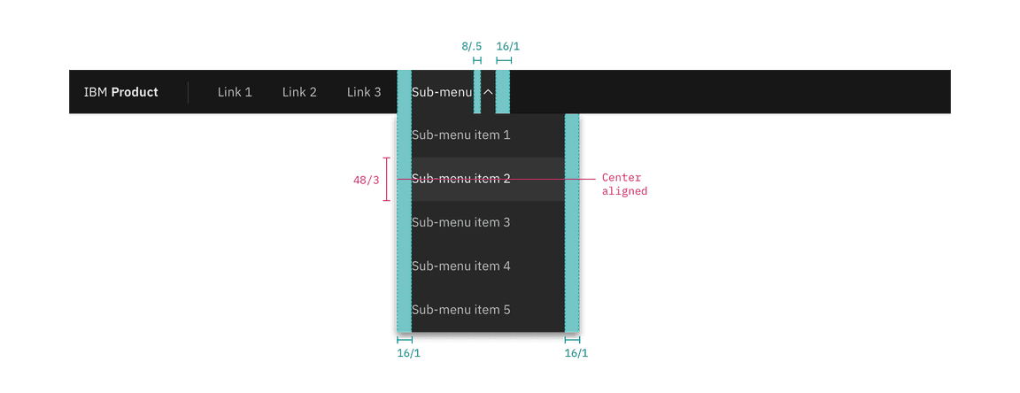
Structure and spacing measurements for header submenu | px | rem
Responsive behavior
In smaller browser windows,
menu items
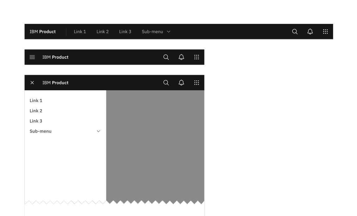
Responsive behavior for UI shell header